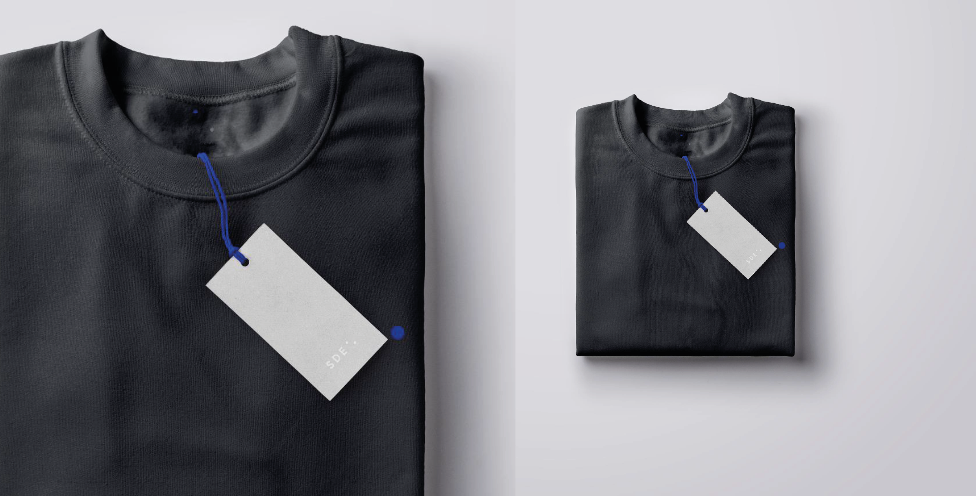
SAMSUNG DESIGN EUROPE REDESIGN
Context: Samsung Design Europe becomes 20 years old. SDE sits on the side of innovation by challenging and being more provocative in our approach to solutions.
Role: Motion / visual designer
The logo and print designs were handled by another designer. The rest were handled by me. Motion, visuals, look, colours, pace, tone and assets. The entire process were motion led.
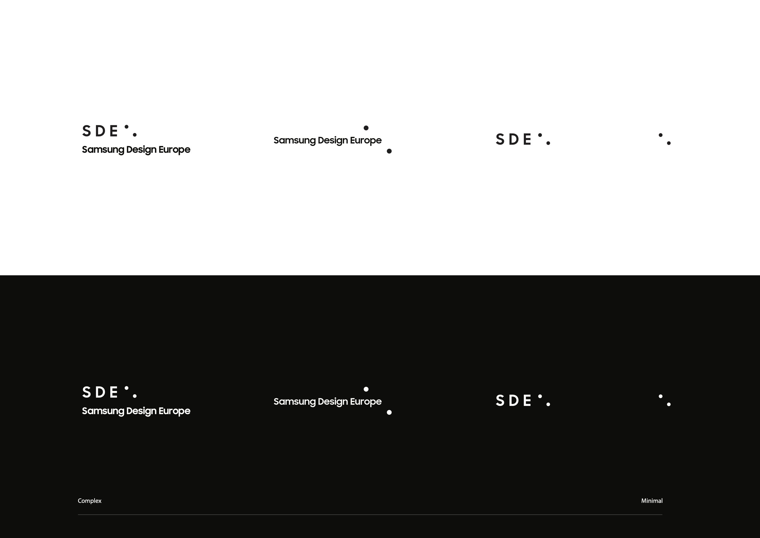
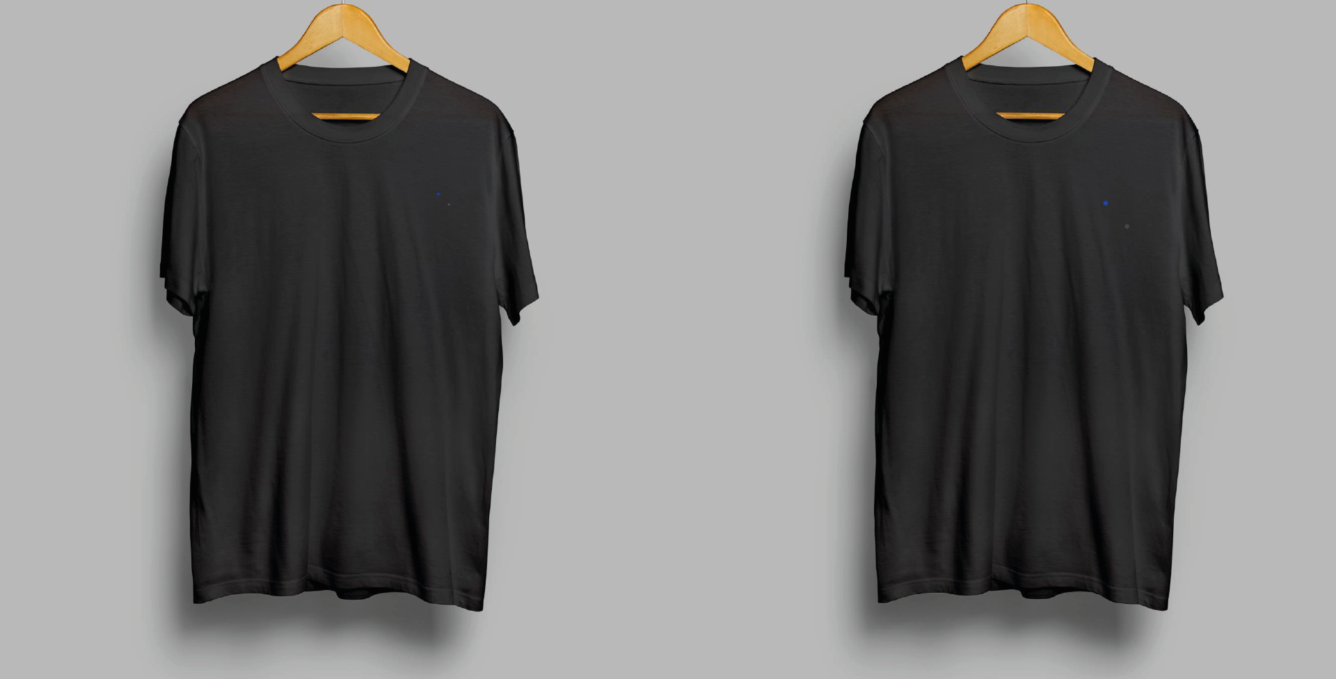
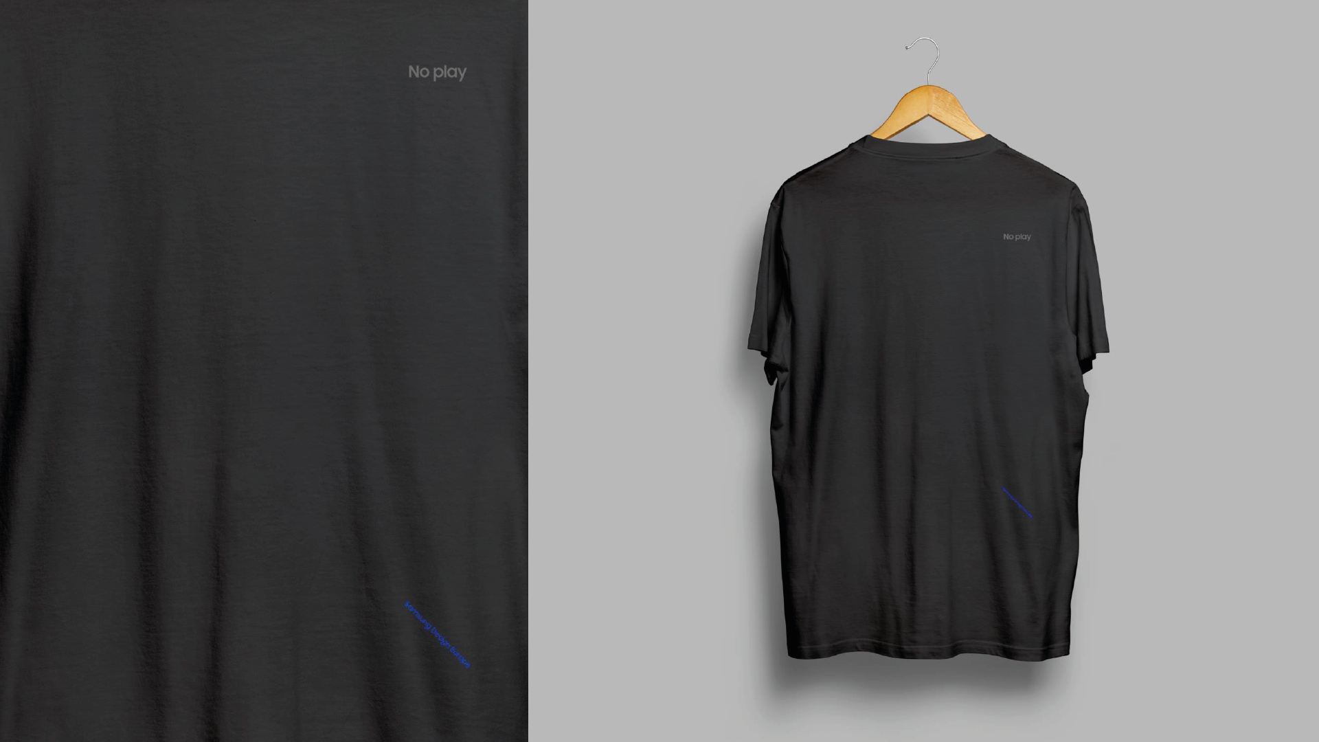
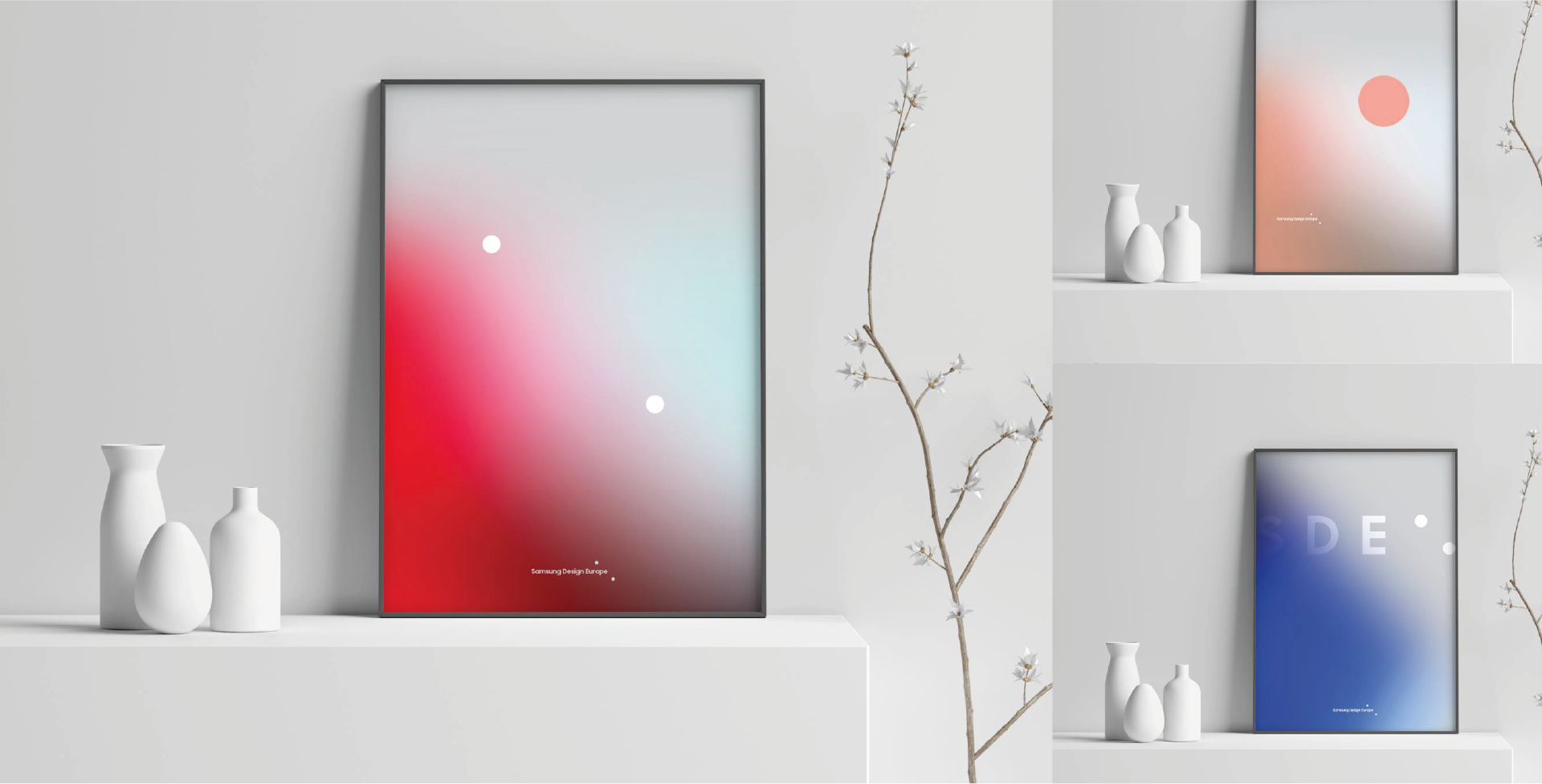
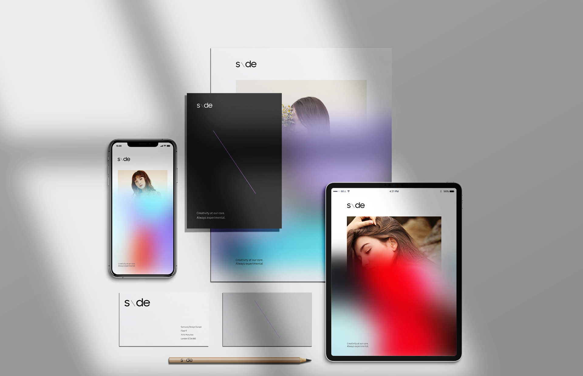
I was tasked to design a new visual identity motion first for Samsung Design Europe that includes icon design, branding, print and motion. Designed assets so any one including non-designers can make their presentation or align with the branding and SDE.


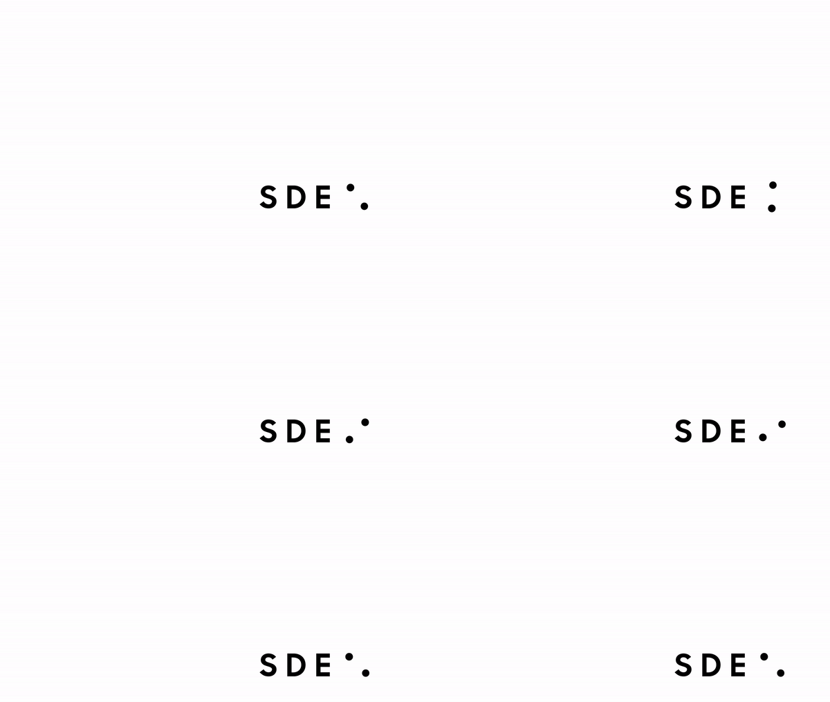
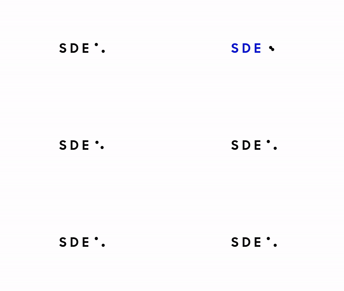

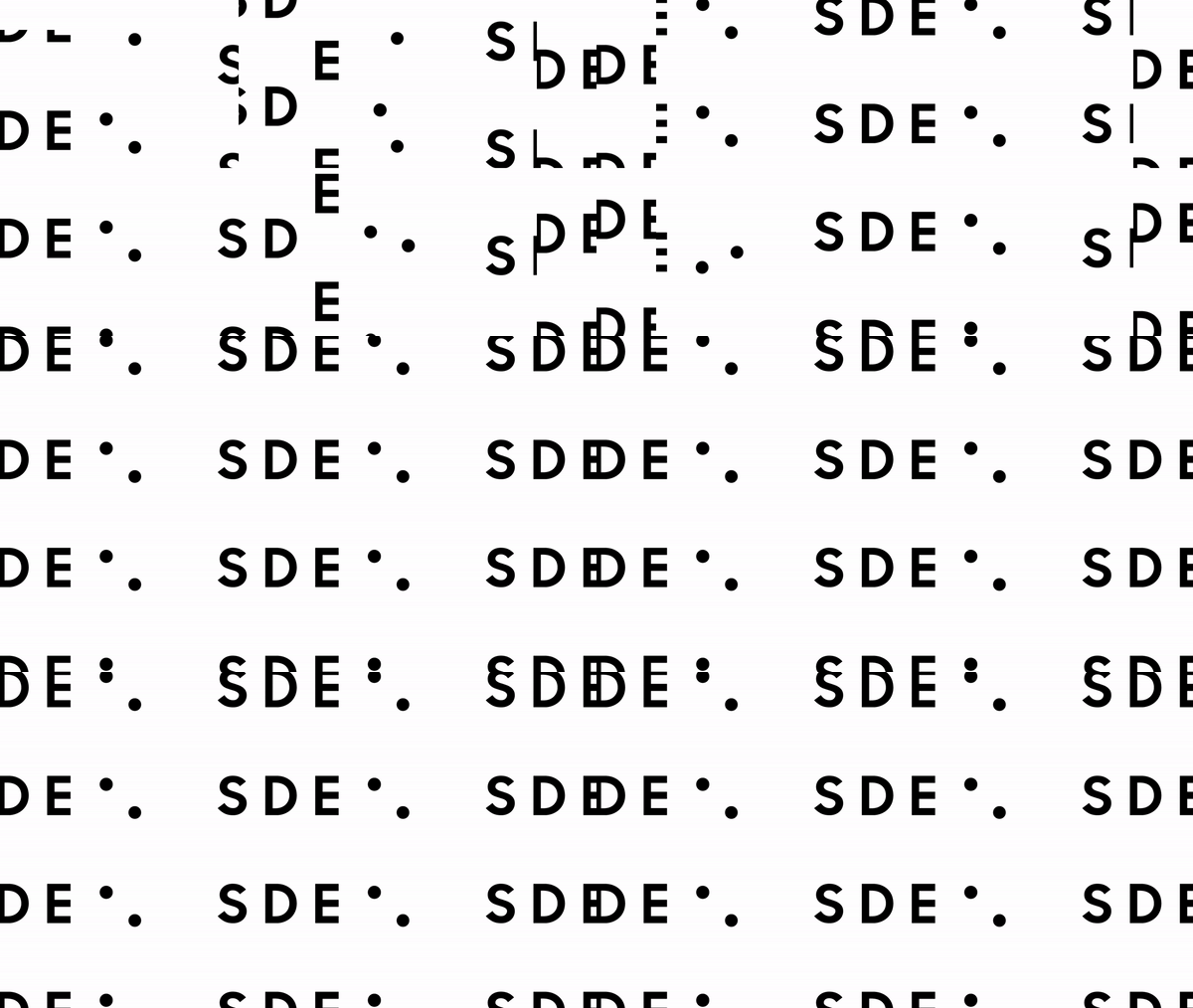

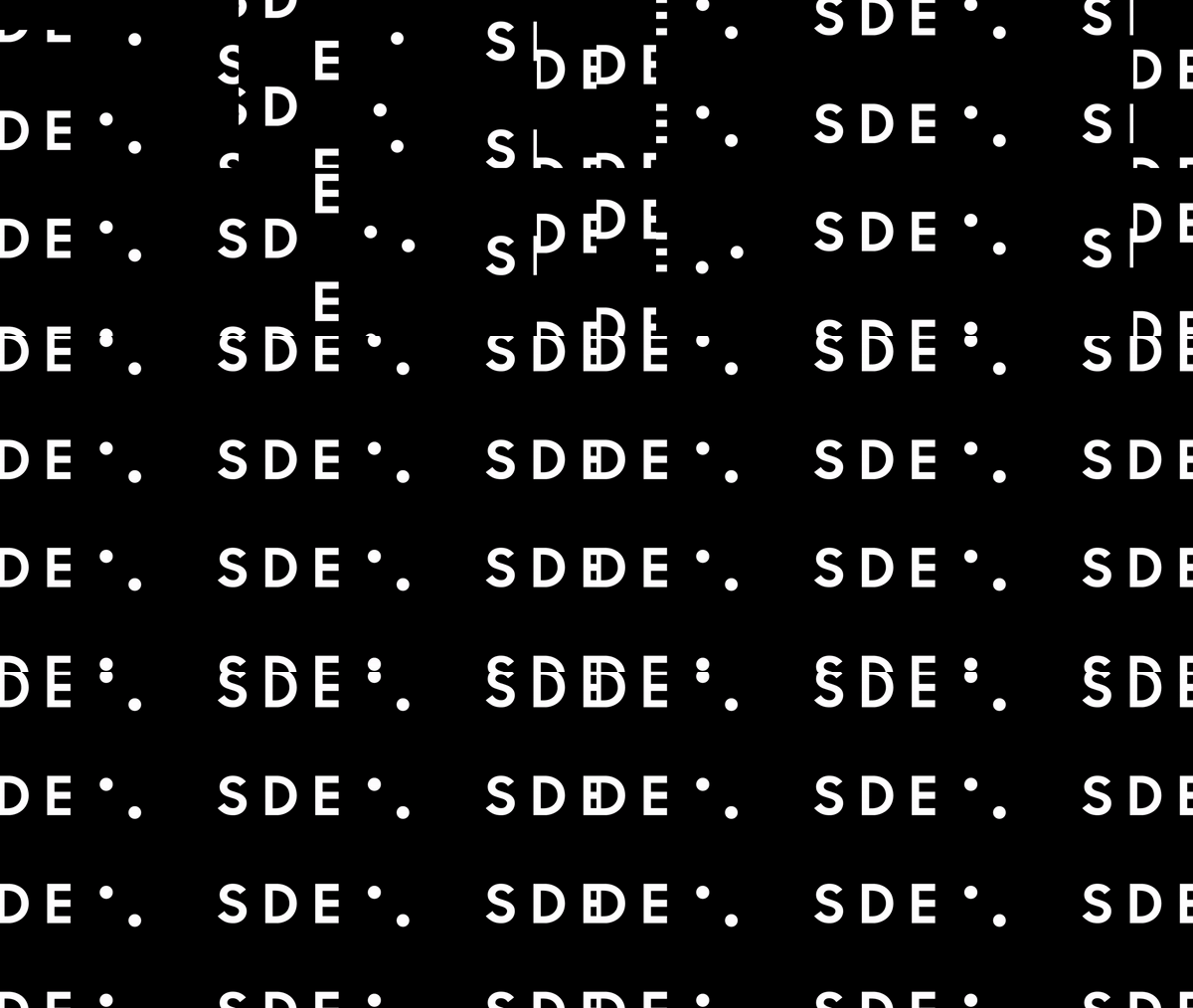
Signage designed to fit the SERO TV which rotates vertically and horizontally. This allows all kinds of visitors and workers to feel proud to be stepping into SDE.
SIGNAGE
SIDE BY SIDE SCREENSAVERS
CELEBRATORY APPROACH
PRINT DESIGNS


